The situation
Checkout was one long page: about 20 questions shown at once, none of them depending on which test you bought, laid out in several columns so the whole form would fit on one screen. Many people started checkout; few paid.
The fork
Baymard Institute's checkout research says the number of steps matters less than what the customer has to do on each one: how many fields, and how they are laid out. Multi-column forms in particular perform worse. Steps were the simplest way to keep every screen short and single-column. They also did two things one page could not: the clinical questions depend on the test, so they only make sense once the cart is settled, and the contact details come in before anyone reaches payment.
What shipped
It shipped in June 2023 as one release, the new price page: step-by-step checkout, new cart logic and a proper mobile layout. Step one: contact details. Step two: clinical information, with questions depending on the chosen test. Step three: payment.
What happened
Visitors fell. Checkout revenue grew. index, May 2023 = 100 · revenue through the site's checkout vs new visitors · 2023
| Month | Paid orders | Revenue, $ | New visitors |
|---|---|---|---|
| Feb 2023 | 475 | $106K | 146K |
| Mar 2023 | 584 | $148K | 167K |
| Apr 2023 | 588 | $144K | 163K |
| May 2023 | 564 | $151K | 149K |
| Jun 2023 | 701 | $177K | 136K |
| Jul 2023 | 747 | $181K | 136K |
| Aug 2023 | 664 | $161K | 137K |
| Sep 2023 | 731 | $174K | 136K |
| Oct 2023 | 782 | $174K | 125K |
| Nov 2023 | 776 | $194K | 150K |
| Dec 2023 | 908 | $206K | 151K |
How the money is counted: had conversion stayed at May's level, June and July would have brought about 420 fewer paid orders. At an average order of about $230, that is roughly $95–100K over the two months, or $45–50K a month at mid-2023 exchange rates.
There was no paid traffic at all, so no campaign changed who was arriving at the site between these months.
This is a release, not an experiment: the steps, the cart logic and the mobile layout went out together, so the jump belongs to all of them. Doctor booking launched in August and SEO work in October, so the later months are not clean comparisons. May against July is.
The second pass
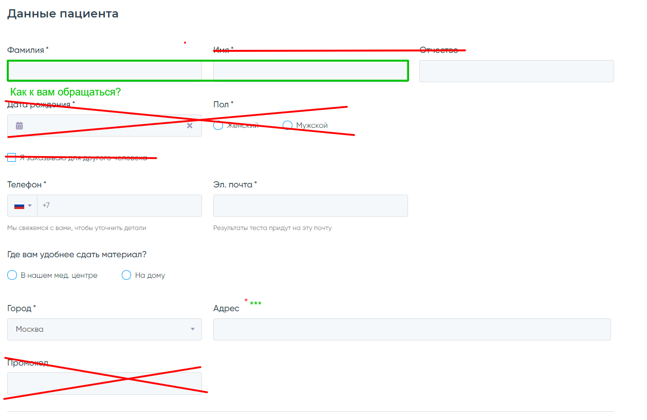
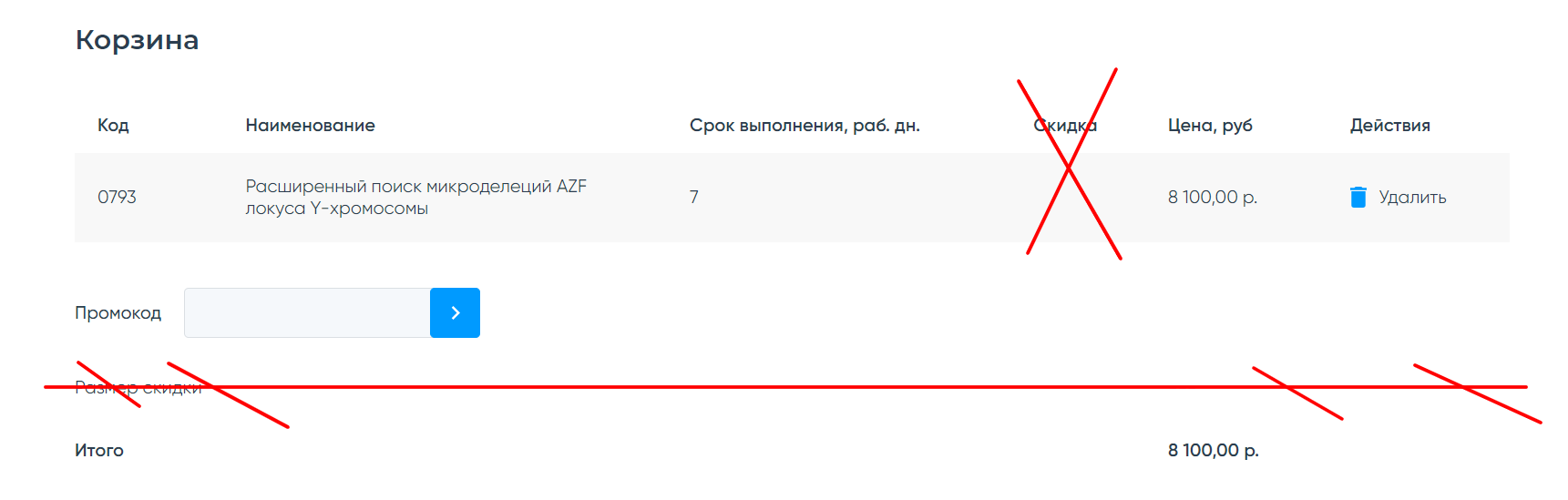
In October 2023 I went through the form again, field by field. Name, surname and patronymic became one field. Date of birth, sex, "ordering for someone else", diagnosis and a duplicated promo code field went. The discount column only appears once a promo code is applied. With that few fields left, the first two steps fitted on one screen, so the spec merged them. Which is what Baymard would predict: steps were never the point, the fields were.
What did not ship
I wanted to go one step further: move the clinical questions after payment and make them optional. The clinic took the patient's history again at sample collection anyway, so asking for it before payment only put more fields between the patient and the Pay button. In my mockup they became a fourth step, "Details", with one reason to fill them in: the contract would be ready in advance, which saves time at the clinic.
It did not get through. The clinical intake had worked the same way for many years, and changing it was a much bigger ask than changing a form. I still think it was the next big step for conversion, but it never ran, so it stays a hypothesis.

Sources
All money on this page is in US dollars, converted from roubles. Monthly figures in the chart and table use one fixed rate, 79 ₽ per dollar (Bank of Russia average for May 2023), so the currency’s fall later that year doesn’t distort the trend. The monthly totals in the text use the rates of the months the money came in.